With the combination of two Python frameworks (Geopandas and Folium [which is itself a wrapper for the leaflet.js library]) we can create a custom choropleth map of gender ratio for each census tract in DC:
Since the data is strictly binary, this map is trad-coded with majority-male tracts in blue hues and majority female tracts in pink hues. Tracts closer to even distribution between males and females are whiter on this map.
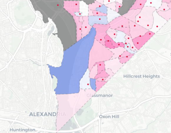
One of the larger blue-hued regions to the south is Joint Base Anacostia-Bolling which has 162 males to every 100 females. Given the military reported that 17% of its active duty force were female in their 2020 demographic report, this high ratio of males to females makes intuitive sense.
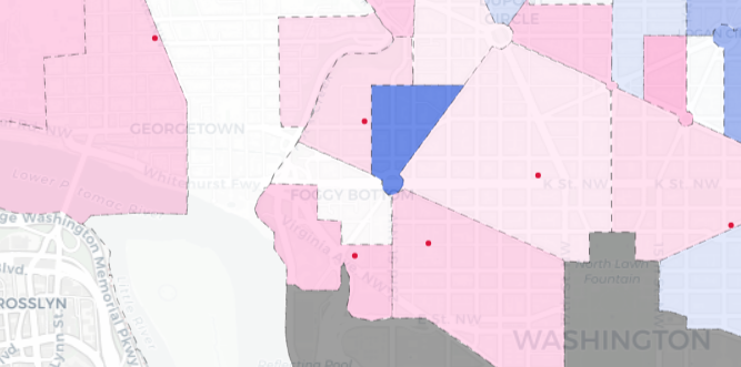
The area with the most males to females at 182/100 is the West End in Northwest. There is no readily available indicator for why this is the case.
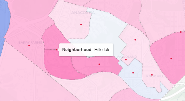
The other end of the spectrum reveals what is probably a stark statistic–one indicative of a legacy of mass incarceration. The census tract with the lowest male-to-female ratio is near the neighborhood of Hillsdale in Southeast. Here there are 30 males per 100 females. In nearby Fort Stanton, this number is 41 males per 100 females.